BRAND | SPROCKET
Creative Crypto
McMillan invents a dynamic brand for the
finance platform that is reinventing banking.
Challenge
Sprocket has managed to do something that no other financial services company has: bring together conventional banking, digital assets, and decentralized finance into a single customer experience. This has created an entirely new way for people to bank. But how do you position, develop, and execute a brand around something that has never existed before?
Insight
Where most companies in the DeFi space seek to attract crypto enthusiasts by playing up their technical expertise, Sprocket has a much broader, more inclusive offering—which meant that their brand needed to go broader, too. It had to appeal to the crypto-savvy, the crypto-curious—and those people who still think crypto is Superman’s pet dog. Sprocket needed to look and feel like a bank—but not like any bank that has ever existed.
Solution
While Sprocket was reinventing the way banking works, we wanted to reinvent the way digital banking platforms present themselves to the world. In a market this complicated, with such a broad audience, we had to build the brand around a simple core idea. In the fragmented world of finance, Sprocket is giving customers an intimate, effortless connection with their money—so we built an intimate brand that makes finance feel effortless.
"McMillan has been an essential partner in bringing our platform to market. From helping us clearly articulate our offering, to designing a beautiful brand that feels unlike anything else in our category, they’ve delivered at every single step."
Mollie Martin, CMO, Sprocket Financial
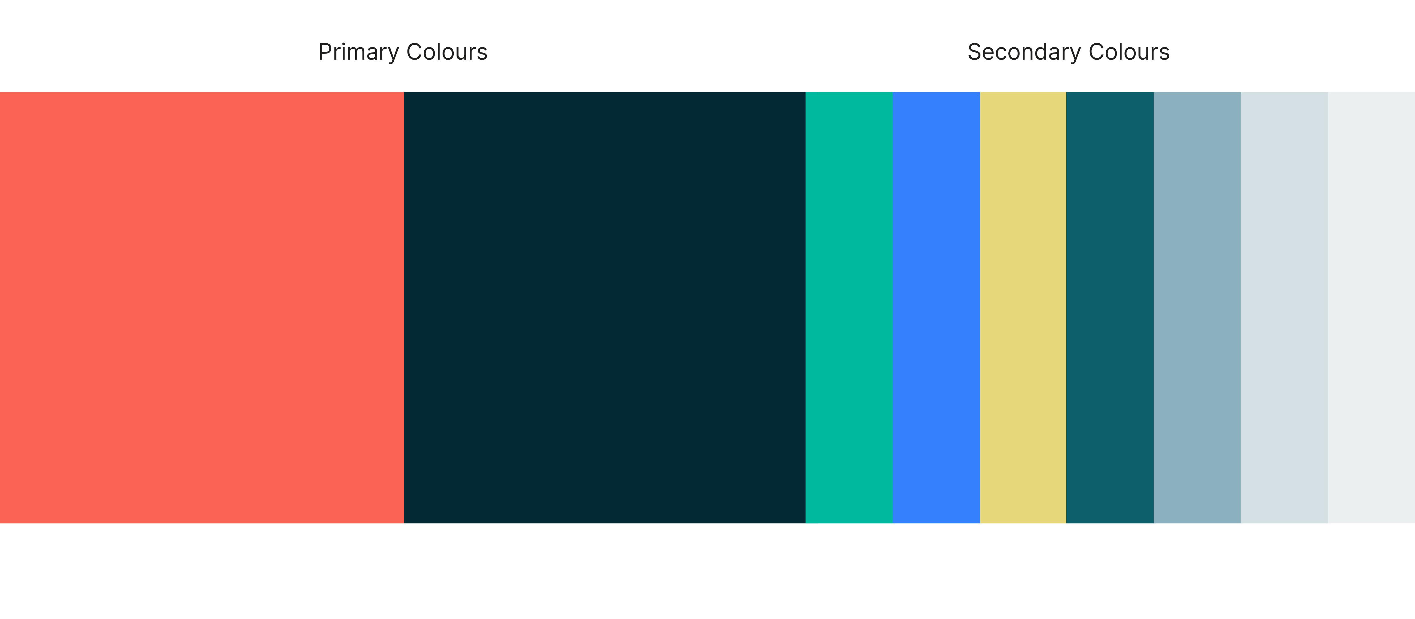
Logo, Colour, and Design
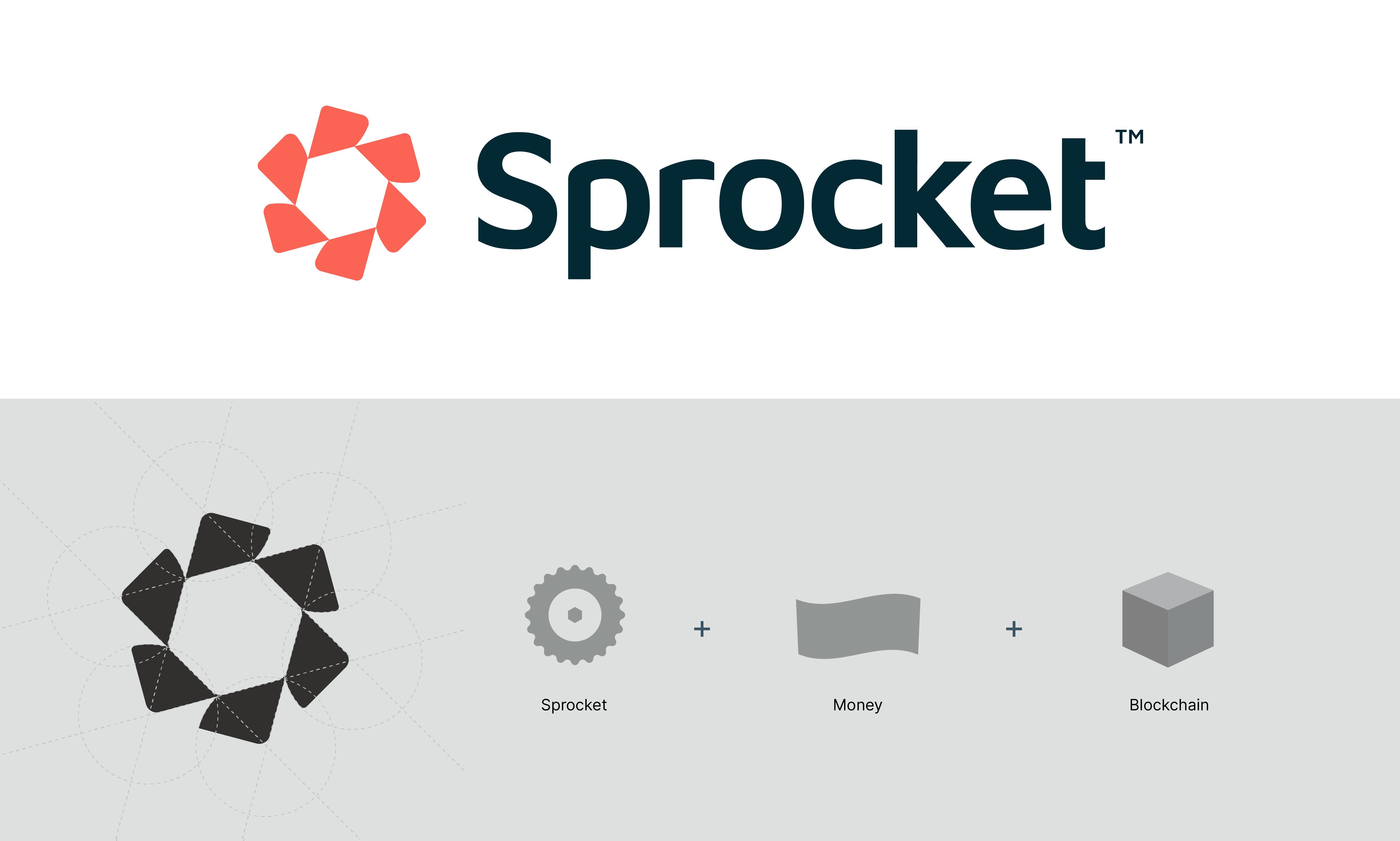
The Sprocket symbol is derived from the core concept of a hybrid approach to finance. It’s built to capture a sense of forward momentum—a future-oriented evolution. With a synthesis of both technological and organic shapes and angles, it’s a sophisticated but simple mark that appeals to enthusiasts and amateurs alike.
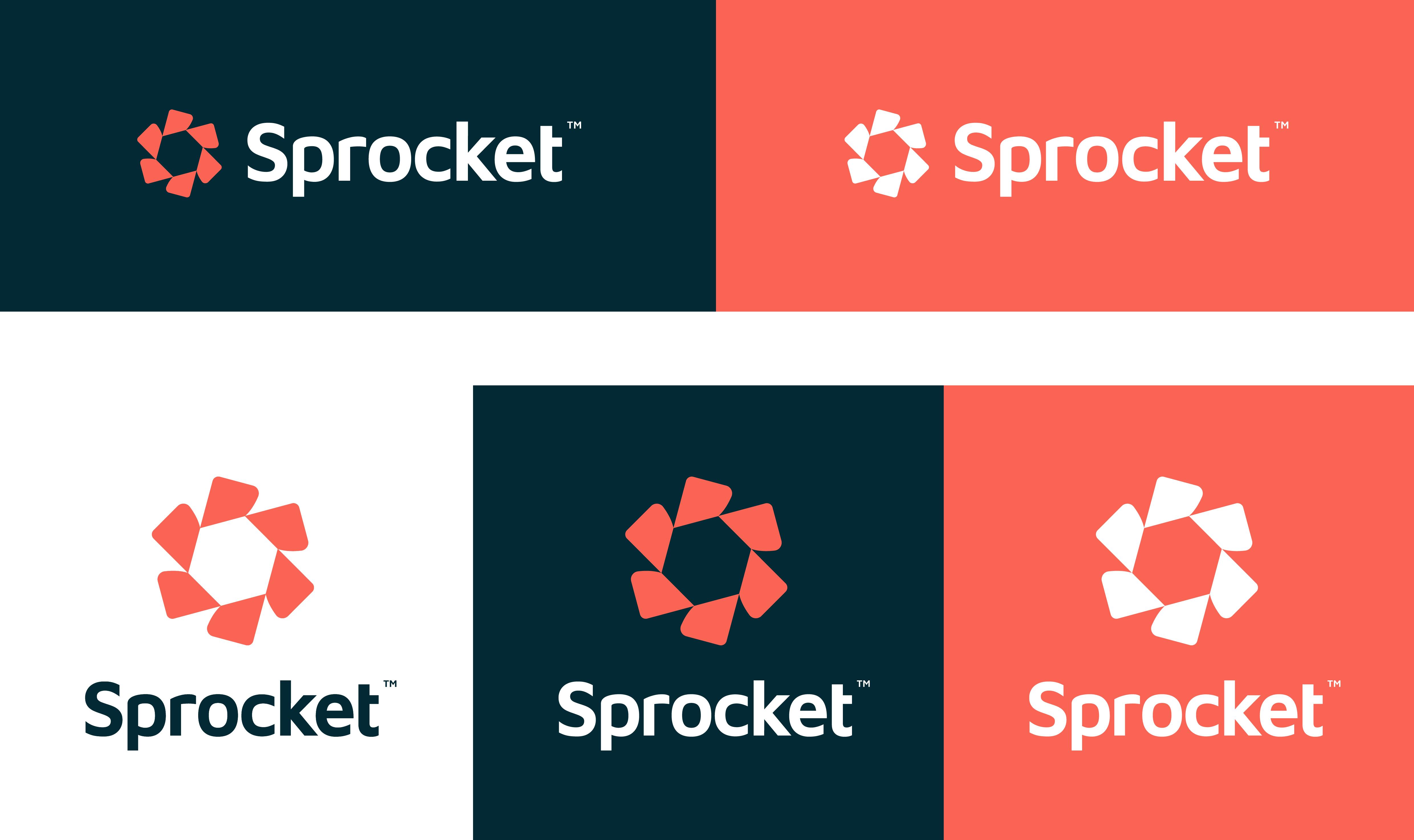
The bright colour palette stands out among competitors, who tend to favor starker moods, and the minimalistic, modern tone is evocative of both a tech-brand aesthetic and the friendliness of a consumer financial institution. The design elements are likewise purpose built to show clarity, linearity, simplicity, and to embody the freedom that Sprocket offers its customers.

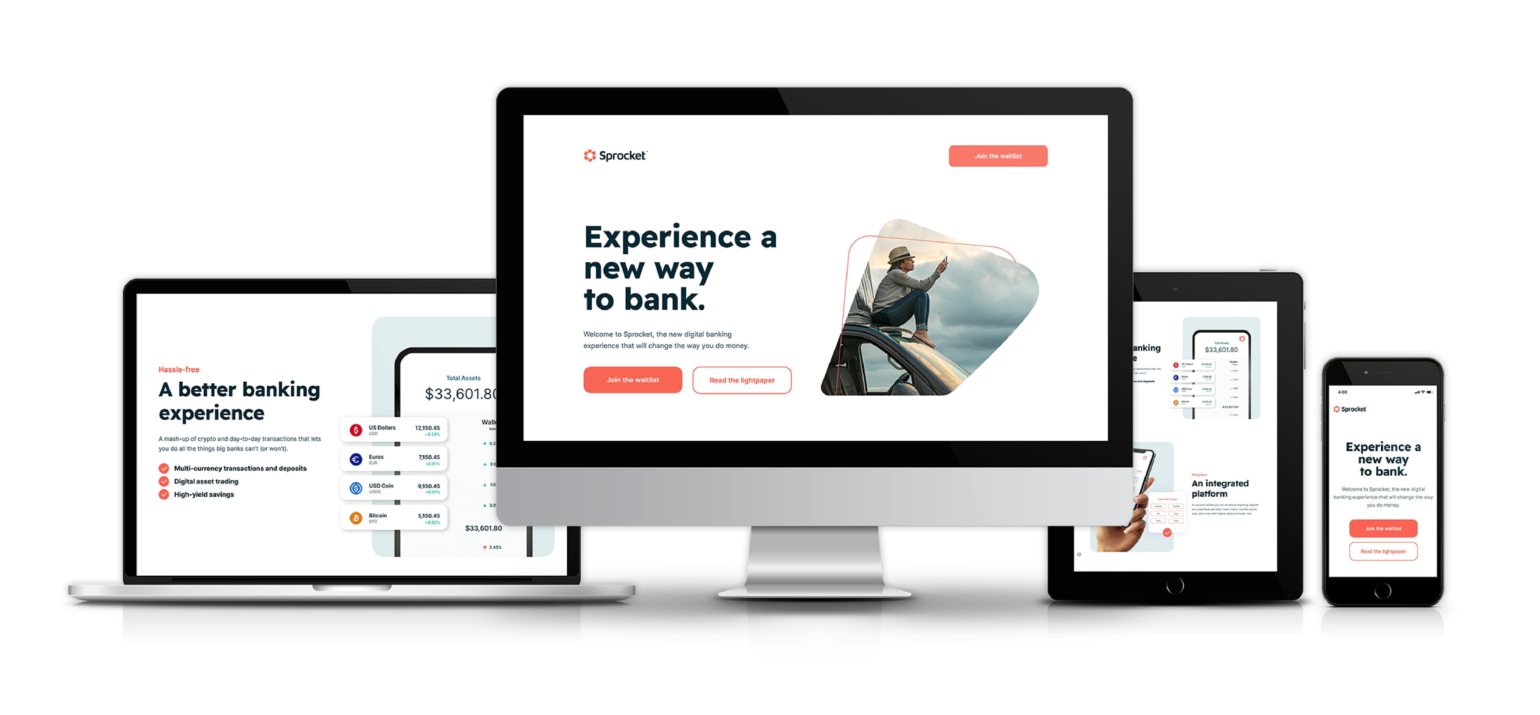
Website
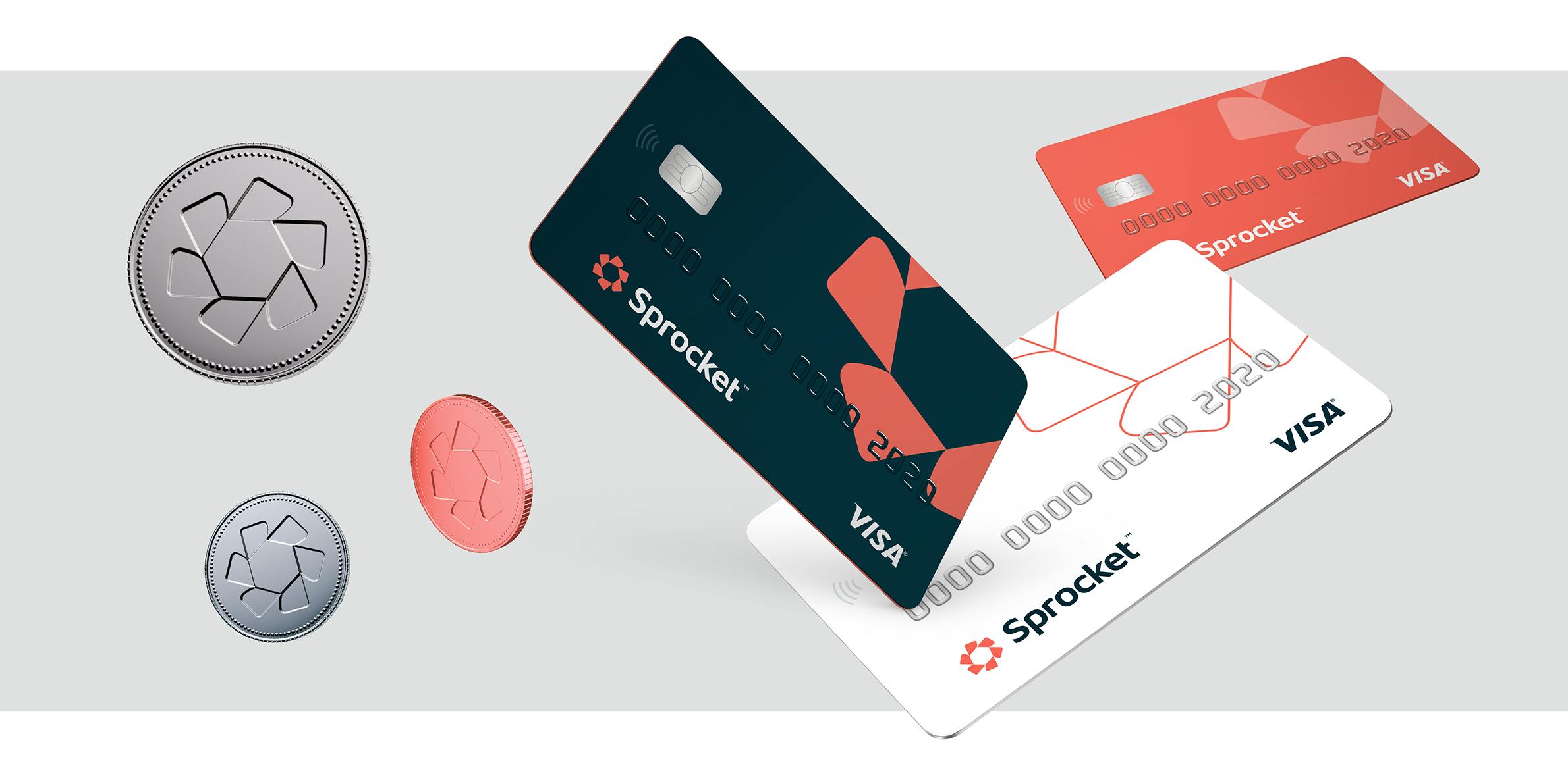
Credit Cards and Tokens
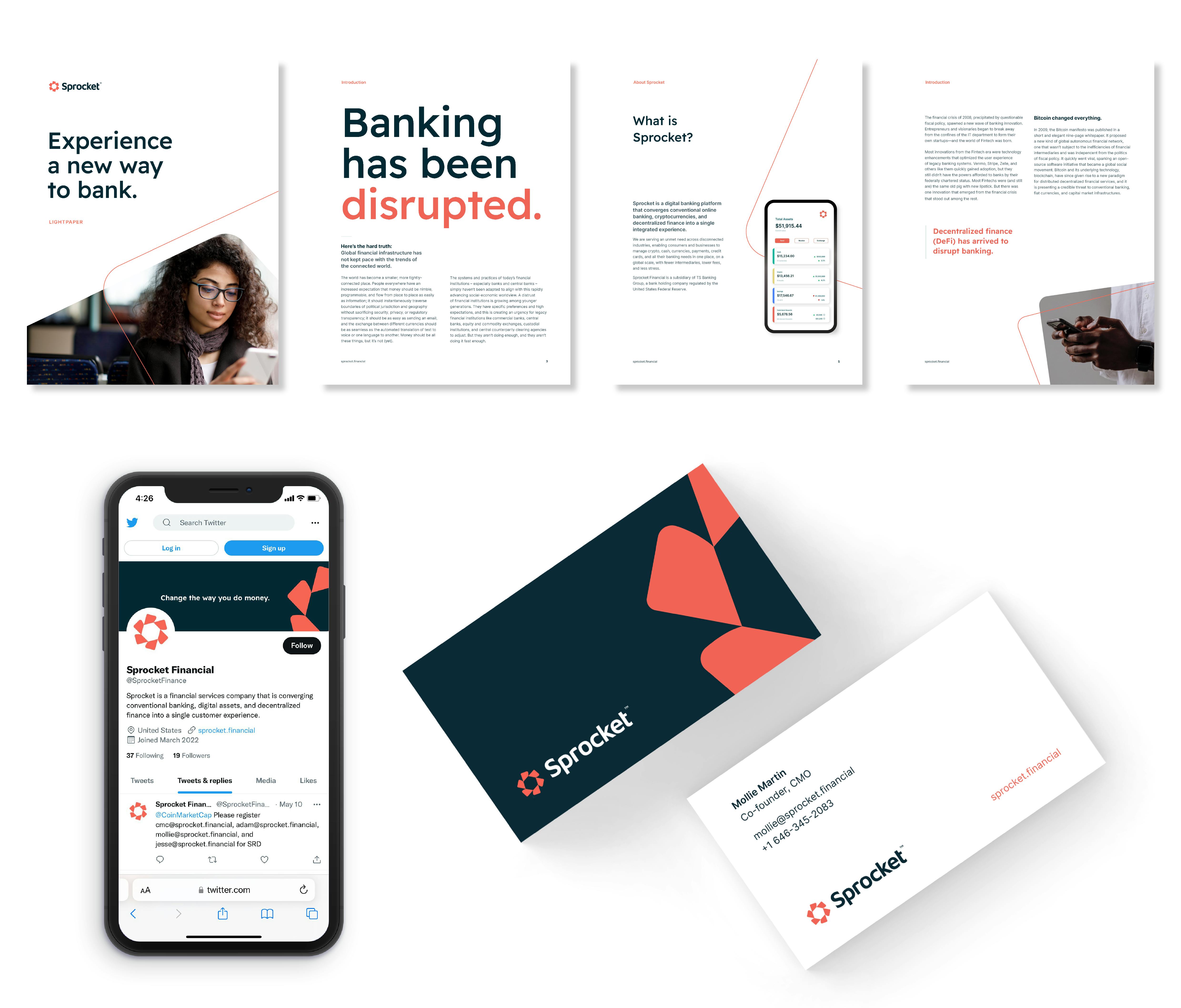
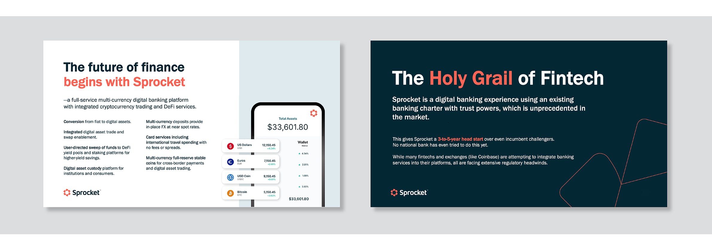
Lightpaper and Overview Deck